How Many Design Changes Has FYT Gone Through? Five Visual Iterations in Fifteen Years
A platform’s interface design is the most honest expression of everything it stands for. The colors, layouts, and interactions that greet members each day tell a story no advertisement can replicate.
From 2011 to today, FYT has undergone five major visual transformations. None were arbitrary aesthetic choices. Each was a deliberate response to the brand’s evolving positioning, its members’ needs, and the shifting landscape of the industry. Traced in sequence, these changes reveal a clear arc — the journey of a brand maturing from its earliest days into a refined, experience-driven platform.
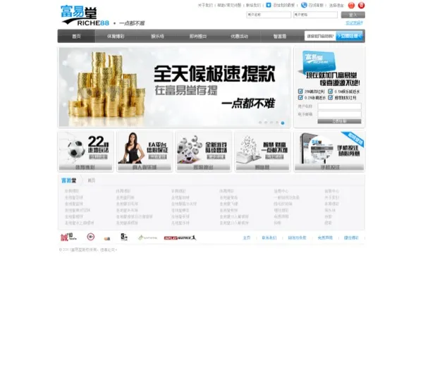
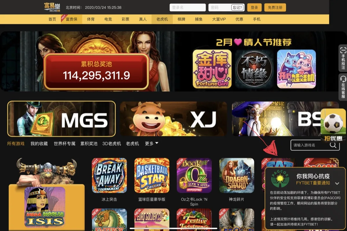
What Did the Original FYT Website Look Like? The 2011 Grey-Blue Era
FYT’s first face was a study in restraint.
The original website paired soft grey tones with light blue accents — a design language deeply influenced by the Apple-inspired minimalism that defined the early 2010s. Branded as Riche88 (富易堂), the interface was clean and uncluttered. Navigation was straightforward. Content hierarchy was immediately legible. At the bottom of the page, partner logos — Cube, Entwine, InPlay Matrix, and others — sat in a neat row, quietly signaling the platform’s institutional backing and industry credentials.
There was nothing loud about this design. That was precisely the point. For a newly launched brand operating within the Cube group ecosystem, the grey-blue palette communicated exactly what needed to be communicated: stability, professionalism, and a commitment to the long game. It was a design that said, “We are here to stay.”
The clean aesthetic also reflected a practical reality. In 2011, the platform’s focus was on delivering a smooth, reliable betting experience above all else. Ornament took a backseat to function — a design philosophy that, in hindsight, set the tone for everything that followed.
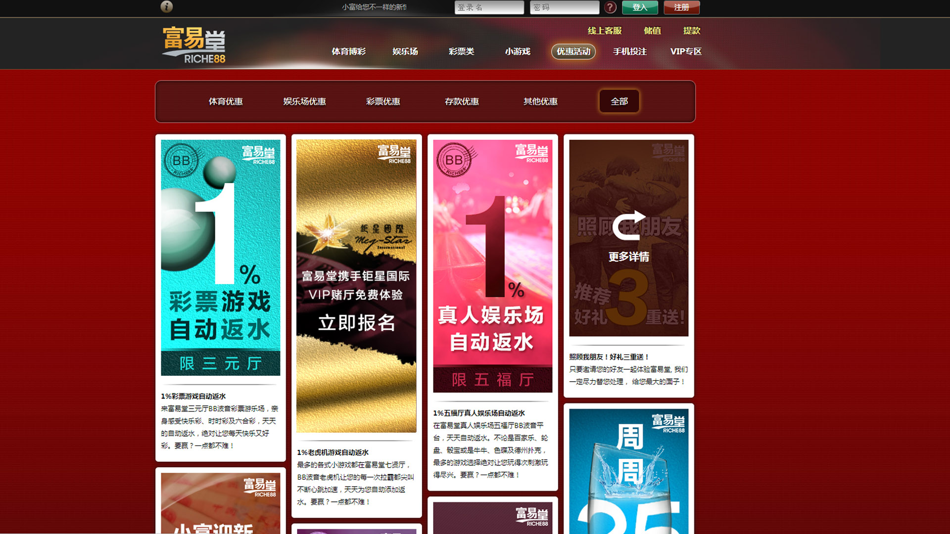
When Did the Red-Gold Look Appear? The 2015 Macau Juxing Partnership Era
As the brand deepened its partnership with Macau’s Juxing International (钜星), FYT’s visual language underwent its first significant transformation.
The grey-blue palette gave way to deep red and gold — a deliberate shift that mirrored the brand’s strategic direction during this period: stepping into Macau’s physical VIP lounges and serving high-end clientele face to face. The deep crimson conveyed gravitas and trust; gold accents signaled prestige and discernment. The overall visual atmosphere evolved from the lightness of an internet product toward the weight and warmth of a landed casino environment.
During this era, brand magazines were distributed across Juxing’s VIP lounges in Macau’s major casinos. The online platform’s visual identity needed to feel seamless alongside these physical touchpoints. The red-gold palette was born from this convergence — colors on screen that would feel familiar and consistent to a customer walking into a VIP lounge.
The Red-Gold era marked the first time FYT’s visual design explicitly projected the quality of a concierge service rather than simply a digital platform. It was also a formative chapter in the brand’s design education: learning how visual language can communicate premium positioning — not merely aesthetics, but intent.
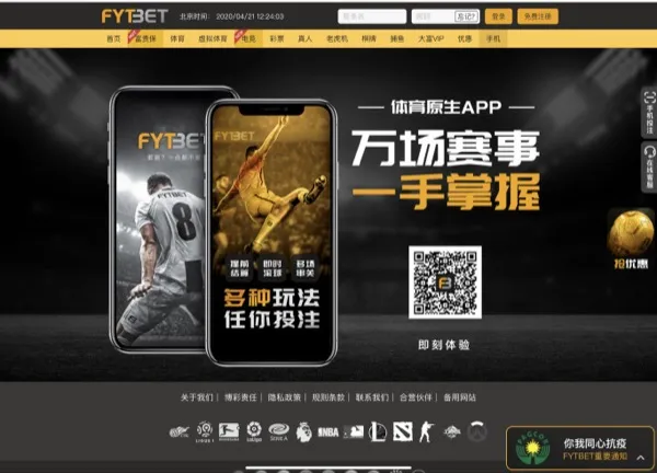
When Did the FYTBET Rebrand Happen? April 21, 2020 — Black-Orange Arrives
On April 21, 2020, the brand completed the most significant visual transformation in its history. Riche88 officially became FYTBET.
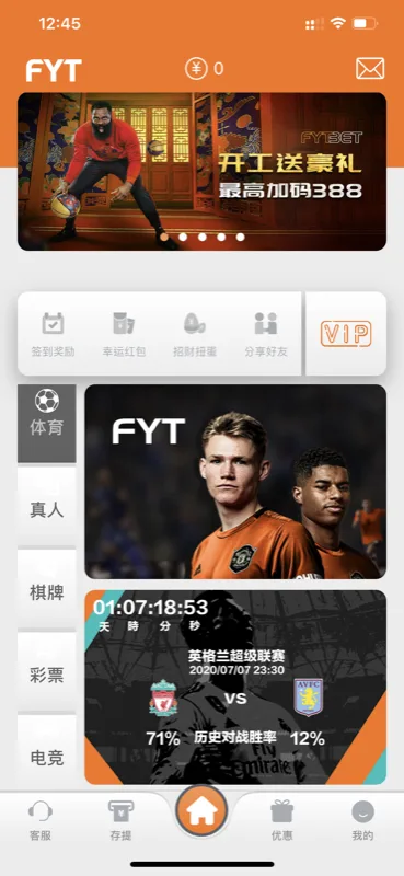
This was not a surface-level refresh. From the brand mark to the color system, from information architecture to interaction language, virtually every visual element was reconsidered and redefined. The grey-blue palette gave way to a far bolder combination — black and orange. Black provided a foundation of depth and premium gravitas. Orange injected energy and instant recognizability. A new FB monogram icon was introduced as the brand’s primary visual anchor, designed for legibility at every scale from app icons to full-width headers.
The rebrand went beyond aesthetics. It signaled a strategic repositioning: from a traditional platform identity toward a more premium, VIP-centered experience. The name itself — “FYT” preserving the pinyin abbreviation of the original Chinese name, “BET” declaring the core business — struck a balance between international reach and cultural rootedness.
The timing carried its own significance. The rebrand launched during the early months of the global pandemic. Rather than treating it as a purely celebratory moment, the FYTBET team placed a prominently visible social responsibility notice on the homepage — a message of solidarity with members during an uncertain time. Many long-time users later recalled this detail. In a moment that was meant to showcase something new, the brand chose to also demonstrate something enduring: its commitment to standing beside its community.
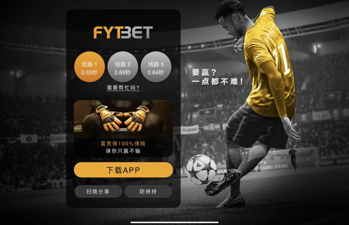
Time has validated the black-orange choice. The color system is distinctive enough to build strong brand recall, yet balanced enough to avoid visual fatigue during extended daily use. Since its introduction, this palette has become the bedrock of FYTBET’s visual identity.
Why Did FYT Switch Back from All-Orange? The 2021 App v3.0 Experiment
A successful design system can become a comfortable cage. FYTBET’s development team chose to test the boundaries.
In April 2021, App v3.0 arrived with a visual direction that surprised even loyal users — a fully orange interface. Orange graduated from supporting accent to absolute protagonist, saturating navigation bars, content cards, buttons, and backgrounds alike. The entire app glowed with a single, unmistakable hue.
This was a deliberate experiment in brand maximalism. The team wanted to answer a fundamental question: what happens when you push a brand color to its absolute limit? In terms of raw visual impact, the answer was clear — any user opening the app experienced an immediate, almost visceral sense of brand identity. There was no mistaking what platform you were on.
The experiment was also a demonstration of a deeper competitive advantage. The speed at which the all-orange design moved from concept to live deployment was possible only because of FYT’s fully in-house development capability. No third-party vendors to coordinate with, no external development queues to wait in, no white-label constraints to navigate around. Idea to execution, controlled end to end — a tangible benefit of the self-built tech stack.
The all-orange era ultimately became an important footnote in the brand’s design history. It proved the team’s willingness to take creative risks and its ability to execute rapidly. More importantly, it generated real-world usage data and member feedback that directly informed the next — and most refined — iteration.
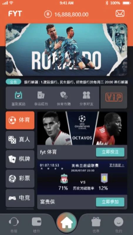
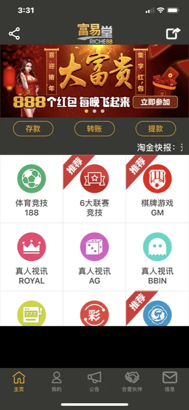
What Is the Current App Version? The v4.1 Refined Black-Orange Design
The all-orange experiment taught the team something that no theoretical design review could: the precise relationship between brand expression and daily usability.
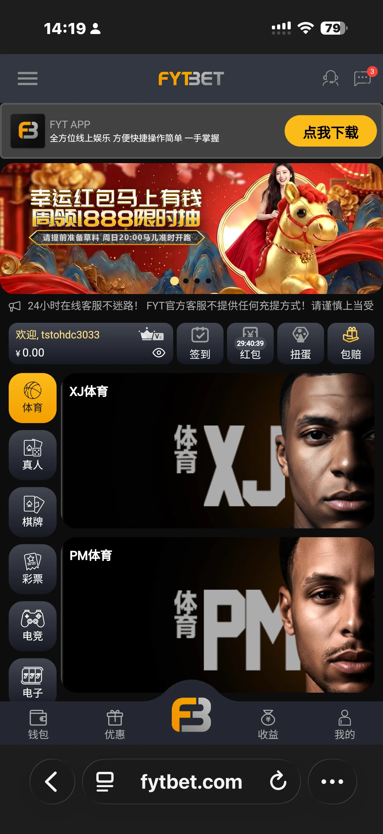
The current App v4.1 deploys a carefully recalibrated black-orange palette — not a simple reversion to the 2020 design, but a new equilibrium informed by everything learned during the all-orange phase. Black returns as the primary canvas, providing a comfortable visual environment for content consumption and extended sessions. Orange appears with surgical precision at key interaction points — call-to-action buttons, status indicators, navigation highlights — guiding the user’s attention rather than overwhelming it.
But the current era is defined by more than color refinement. This is the most feature-rich version of the platform to date, and the design system was engineered to accommodate that density without sacrificing clarity:
- Daily Check-in — Turning routine engagement into a rewarding habit
- Lucky Red Envelopes — Surprise rewards up to 1888, drawing on a deeply resonant cultural tradition
- Friend Share PLUS — A referral engine built on the principle of shared value: the more you invite, the more you earn
- Gacha Capsules — Introducing collectible, gamified experiences within the platform
- VIP Club — Dedicated service tiers and exclusive privileges for the most valued members
- Fortune Insurance (富贵保) — FYT’s proprietary sports betting insurance: if you win, you keep everything; if you lose, the insured amount returns the next day
Each of these features occupies a considered place within the refined visual hierarchy. Design serves function. Function serves the member. This is the principle that fifteen years of iteration has crystallized into practice.
What Drives Every FYT Redesign? The Member Experience Comes First
Five transformations. Grey-blue, red-gold, black-orange, all-orange, refined black-orange. On the surface, a story of shifting palettes. Beneath it, something more fundamental — a brand repeatedly asking itself the same question: what matters most?
The answer has never changed: the member’s experience.
Every redesign began not with a mood board or a trend report, but with a simple inquiry into how the platform could feel more intuitive, more comfortable, more trustworthy the moment someone opens it. This human-centered design philosophy runs parallel to the operational ethos that FYT has maintained since its founding — the understanding that no matter how the interface evolves, the commitment to serving its members is the one element of the brand identity that must never be redesigned.
Fifteen years of visual evolution, and the deepest layer remains exactly where it started.